Fit Break by Weight Watchers
I came on to this project at the turning point. The visual design and branding scheme was already determined, as were a few features, but a lot of kinks still needed to be ironed out. There were interactions still undetermined, and major gaps in the flow.
My Role
I picked up this project and ran with it, making my alterations to the experience design based on research and testing I conducted myself, and whatever former testing outcomes I could unearth. I was the sole UX designer on this project, so I owned the interactions but I chameleoned into the pre-existing branding style. I worked closely with my producer and my developer so the whole project went smoothly.
Tools used:
Sketch
JIRA


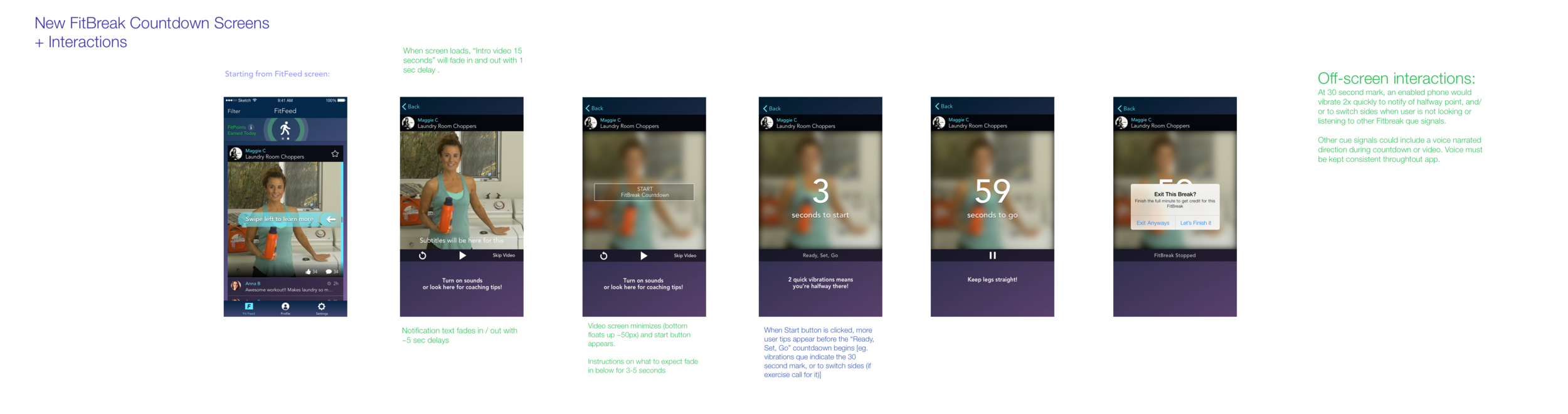
Countdown-to-start timers make people anxious.
Turns out, after testing first iterations I learned countdown timers make people nervous! Makes sense. It was beneficial for users when counting down to stop, but for starting it created unpleasant tension for users, reminding them of a race. So I added a more obvious start and pause button, which really helped. I also added some reassuring guidance text and vocals - and reminded them to turn their vibrations on to be cued for my "halfway" reminders.
[click to enlarge]
It's hard to look at a screen when you're performing a 60-second exercise - especially at the office...
..So I added a vibrate feature to indicate the halfway mark, which was much more necessary for the high-intensity users.
Annotations on a later iteration of flow for commenting

In my opinion, it's far from perfect. I wish we could have had more time to improve content and unify the visual design,
but we were a lean, mean, agile team.
Here are a few screens