Small Business Lending
Project Overview:
A New Platform for Lending and Loan Management:
We were tasked to create the bank's first digital footprint for the in the Small Business Administration lending space. We wanted a product that would also greatly improve the experience and bring in - and keep - clients.
The Product
I designed a product that guides people through the painstaking and lengthy process of applying for a Small Business Administration Loan. A process infamous for being riddled with surprises, paperwork, and being left in the dark for weeks. I wanted to make something that enabled users to get started on their tasks, while holding their hand through this process.
My Role
I worked on this project from inception to stakeholder buy-in. Starting with research on all sides of the lending experience - from Loan Officers to clients, and moving into rapid and digital prototyping for this all-new experience. My role was as interaction designer, visual designer, and prototyper. I worked to create the new brand identity, the product concept and strategy, and the paper -to polished digital prototypes.
Tools and Methods Used:
- Sketch
- Invision
- Rapid prototyping
- Rapid iterative testing and evaluation
- Competitive research

The landing page.
Research Findings and Definition
Initial research I conducted involved sifting through SBA subreddits and user groups to get a sense of what people were saying. I also conducted interviews with individuals that had gone through the SBA lending process, but not with this particular bank. This gave me a sense of where to direct my questions for the research team to take on.
Later, our research team recruited members of our SBA Lending group to gain more insight on ourselves. We then had interviews with current and prospective clients
We learned the process is...ahem...complicated, with several handoffs to different points in the bank...

Mapping out the current SBA application to loan process.
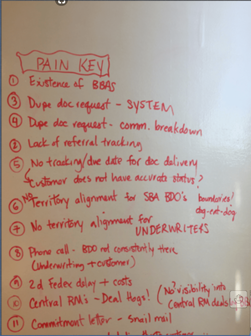

The Pain Key - annotating which parts are what pain in the process. They correspond to spots in the user journey. (Click through to view all)
The Preexisting User Flow
****See these bright yellow stickies lined up top? This is the IDEAL flow - without any complications.****
Below the straight arrows is the actual flow.

The complexity of this process is a systemic issue outside of our project scope. But that doesn't mean I can't solve the most glaring pain points. To meet business needs and user needs together I find a way to accommodate both and improve the experience for everyone.
An Emotional Landscape
Pressure, anxiety. These people have a lot on the line, often are putting a lot of money down in order to get equipment or buy a building and risk losing a big chunk of that it if the loan falls through at the last minute.
Overwhelmed by the process. Users are put through the ringer for this loan. So are the lenders. The process is long and daunting, and as soon as users think they have submitted the last thing, the bank comes back asking for "One more" set of documents, that they didn't realize they'd need until they got the last set. It feels endless.
This is worsened by the fact that once the user has finally completed the application and been approved, they have to submit the most up-to-date version of all these same docs for the loan to be written.
Journey Mapping
For users:


Deeper causes behind pain points I can impact
- A lack of transparency about where they stood along the process timeline made users feel lost, and unassisted. The reason behind this proved to be in two parts. One, the bank did not want to reveal upfront how arduous the process truly is.
- Not being told the full picture of how much paperwork lies ahead, and that they must submit it twice created a lack of trust with the bank.
A full checklist of the bare minimum essentials did not exist. It was almost unheard of as loan officers tailored every loan to the scenario. But more importantly, they feared transparency on the amount of paperwork needed might scare customers off.
- The mostly paper process that relied on faxes and couriers for secure documents to be ensured was a huge drain on time and resources for both the bank and the loan applicant. Steps dragged out. Luckily, the bank had just finished up some tech internally that would allow for digital secure doc delivery, and digital signatures to be used so we incorporated this into our product.
Rapid Prototypes


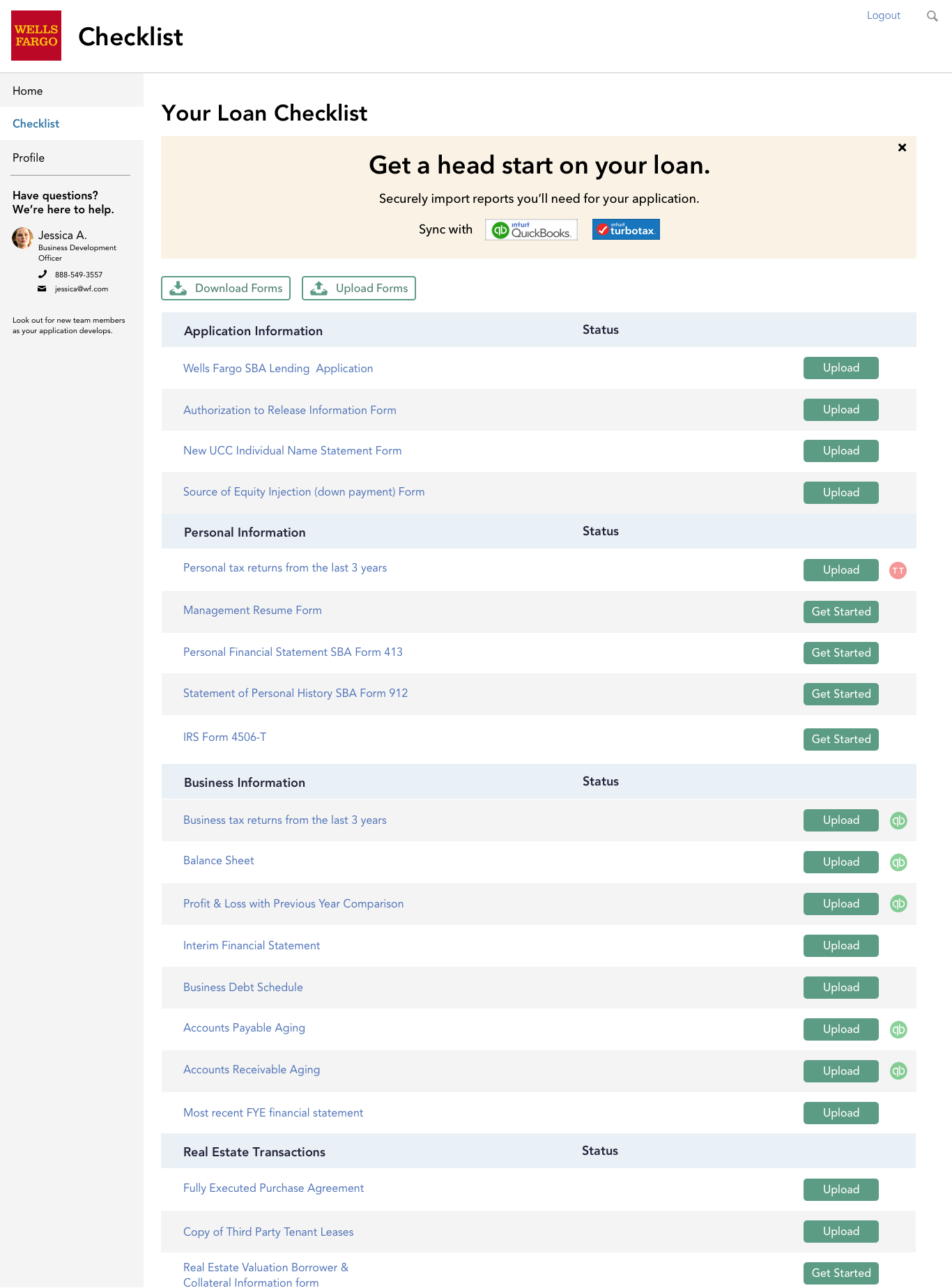
I wanted users to feel like they knew what was going on and that they had one central hub to manage incoming information. From the design studio and rapid prototyping sessions, I landed on a dashboard approach where documents could be handed off from the lending party rep, to the loan applicant and sent back and forth, thus addressing our pain points we chose that we knew we could control.
- Loan applicants would be walked through the documents - viewing examples to ensure they don't confuse the documents.
- They can see then the lending party has received and viewed the document and put next steps into motion.
- Documents can be triggered from loan officers, alerts inform users of new docs, and they can be managed and sent back and forth ad hoc.