Overview
La Cocina is a non-profit restaurant incubator based in San Francisco. They were looking to independently revamp their site and asked us to redesign their catering experience and flow.
Goals
La Cocina wanted to emphasize the story of their entrepreneurs' business endeavors, while showcasing their work, educating visitors about the catering process, and simplifying the request process.
Outcome
I currently work with the client's developers to build our suggested user interface and catering flow. They liked what we came up with so much that they decided to use the homepage design we suggested, which was outside of our initial deliverables.
Skills, Methods &Deliverables:
- Affinity maps
- Research & testing
- Client Facing
- Clickable, Digital Prototype
- Interviews
- Journey maps
- Personas
- Survey design and execution
- User Flows
- User Journey Maps
- User Testing
- Visual Design
- Wireframes
Tools Used:
- Sketch 3
- Adobe Illustrator
- Adobe Photoshop
- Omnigraffle
- Invision
To learn more about the process involved for this case study, read on....
Discovery, Research & Testing
Concept Mapping - (click to enlarge)
This was to work through and synthesize concepts we'd been hearing: the public idea of catering, La Cocina's brand identity, and what services they provide.
Client and Research Take-Aways:
Brand attitude: "Folksy and friendly"
The decision process to choose a caterer: cost, quality, reliability, recognition, giving back to community, etc.
Confusion about what catering is: ordering food items? or trusting event management to make the decision
Personas
Major Discoveries: Too many questions = user anxiety
"Wait, is this form my only chance to communicate with the caterer? I have more details than this question informs them about!"
- Ross, FORM DESIGN TESTER # 8
Messy User Experience Mapping in progress (click to enlarge)
Generally, any catering process starts out with some degree of stress and anxiety.
Long forms bring ANXIETY, users desert their task.
Reassurance through education and feedback imparts a good feeling for users.
(click to enlarge)
Defining Frameworks
Re-concepting the Request Form
Form concept - 1st iteration. Accordion-style page interaction within same page.
Turns out, La Cocina has little capacity to devote to requests from the site, so, when it comes to request forms, they needed more of a filter.
But, Can A Form Be Too Simple?
Second Form Concept:
Catering request form (left) and Request Feedback message (right) [click to enlarge]
Homepage
After
Before
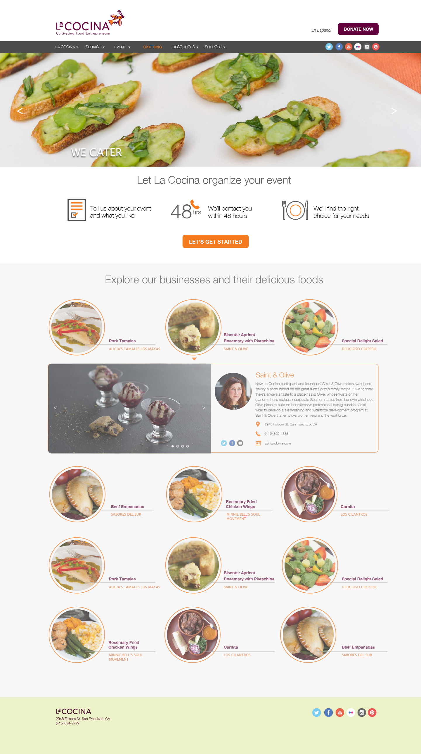
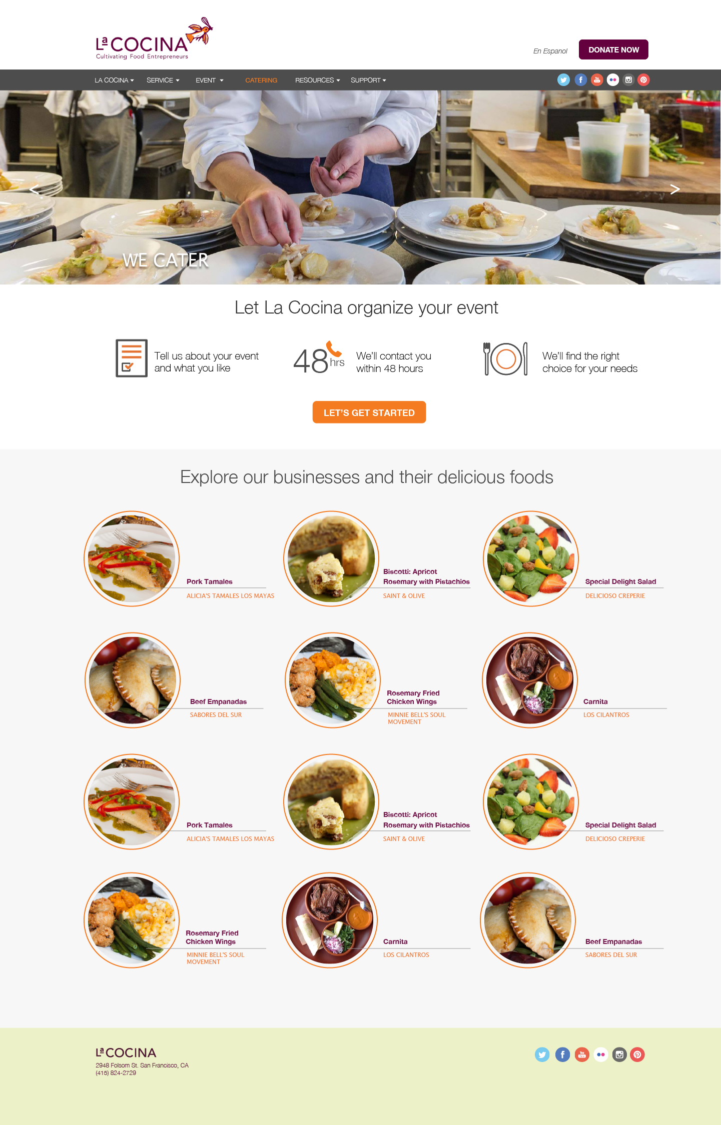
Catering Page
Before
After
How the re-design flows:
La Cocina loved the work so well, they decided to use the overall concept as the model for their entire site re-design.
They are currently working to build this design.
Outcomes:
I can't reveal everything, but for a brief taste:
Instructions: Go through the site straight to the catering page and try to sign up/start a catering request


